
Sharing Research
Pattern Detection in Wearable Sensor Data
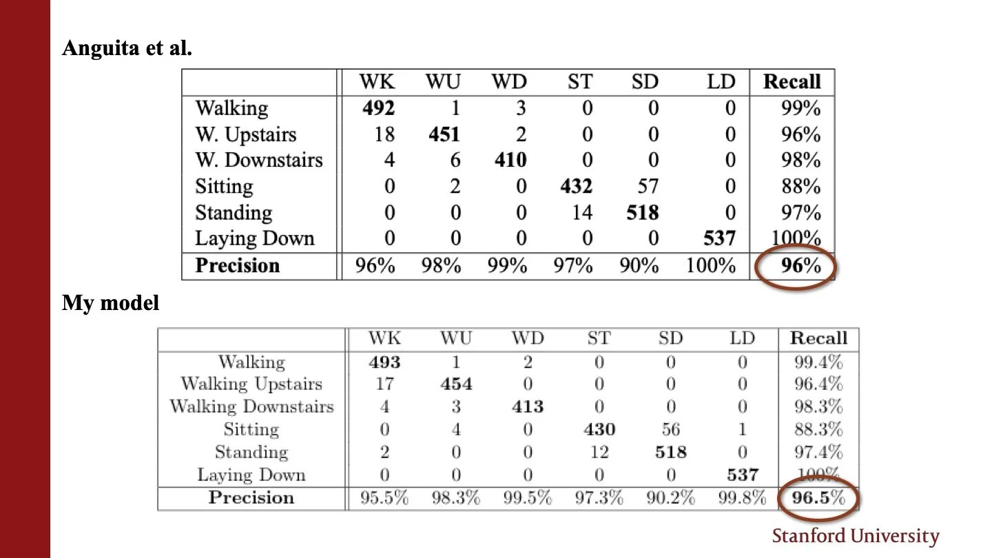
Unlike other artifacts in this portfolio, this is a piece about something I knew nothing about. During my senior winter, I took BIODS 215: Topics in Biomedical Data Science. I had no background in biology, and the class required a final project. I ended up deciding to work on Human Activity Recognition: trying to identify what activity a human was executing based on data collected from a smartphone. This artifact is the slide deck that I used to present my project.
From a research perspective, this was a hard project because I couldn’t simply apply any of the models we had seen in class. Unlike other technical classes that I have taken at Stanford, this class covered a wide range of topics and I had to be creative in how I adapted what we had seen to fit my problem. I think this artifact contrasts some other pieces in this section, like my Natural Language Processing paper. In that class, everyone worked on a Natural-Language-related task, so we received a lot of guidance including relevant papers, starter code, etc. In BIODS 215, student projects covered a very wide range of topics, so it was up to me to seek the resources I needed. This made the process very slow moving. Although I didn’t have enough time to try all the models I wanted to experiment with, I am happy about the skills that I have learned, including how to find my own resources to start a technical project.
The fact that all our projects were so different led me to make specific choices to adapt my presentation: I was talking to an expert audience, but my peers didn’t know much about the type of problem that I was solving. This meant that I had to strike the right balance between expert-level depth on the modeling side and less-expert-level depth on the side of my application: Human Activity Recognition.
Overall, I think I balanced this compromise quite well, as I managed to go into all my models quite deeply, yet only presenting aspects of the field of Human Activity Recognition that were directly relevant to the direct results I wanted present.
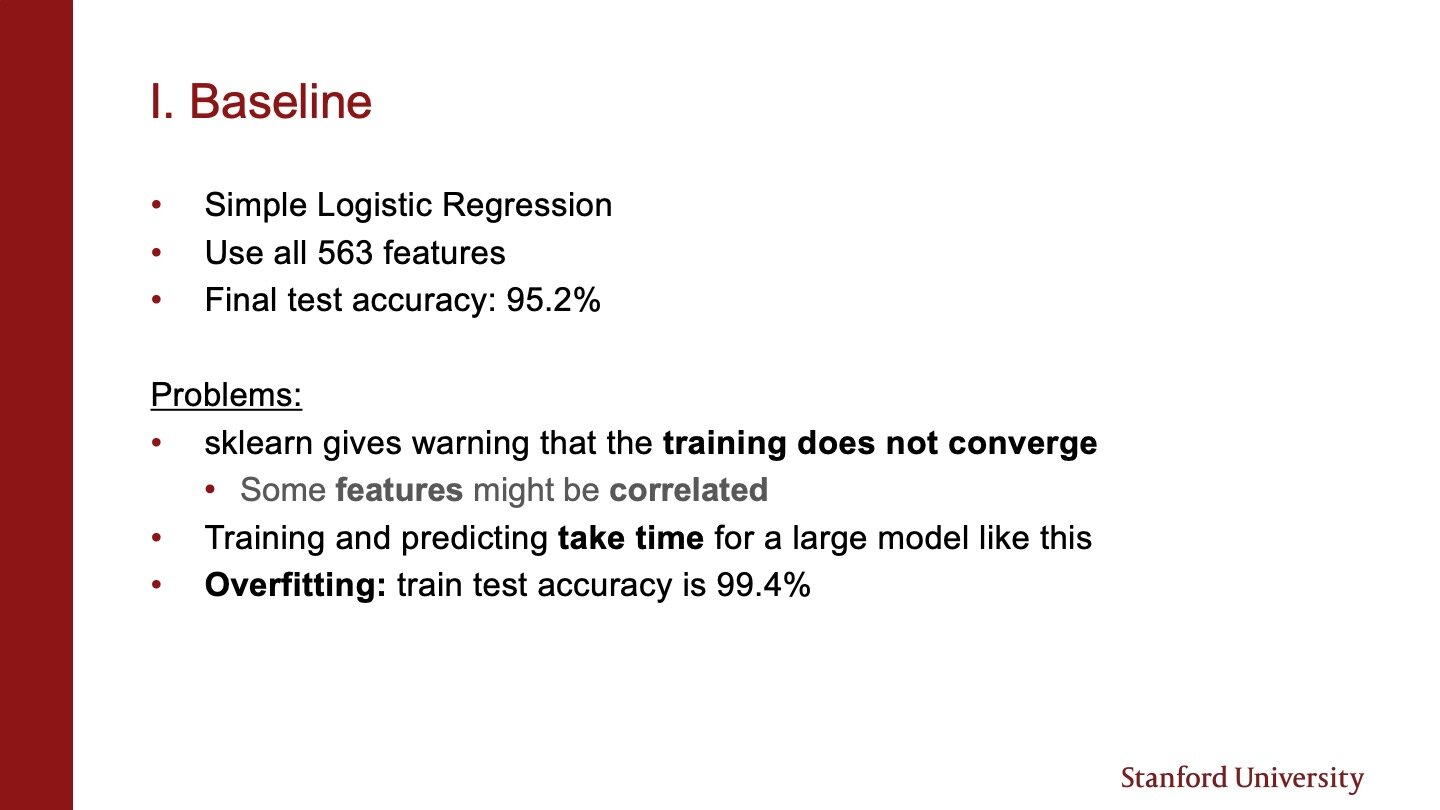
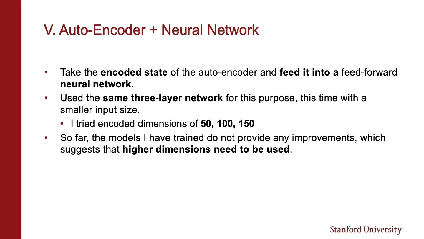
I am also very proud of the way this presentation looks. I chose to use Stanford colors, which in my opinion builds ethos, and I tried to use visuals whenever possible. When I had to use text, I made sure to highlight important phrases using bold to draw my audience to the key takeaways of each slide.








Cover photo by Jens Kreuter on Unsplash